We use Adobe Experience Manager (AEM) as our Content Management System (CMS). In recent years, we transitioned from AEM 6.1 to AEM 6.5. With the transition, a new design system was adopted. I worked together with the UX team to ensure the new components in the design system included accessibility considerations. Moreover, I included code snippets so that when a component was passed on to the development team, they would know how to implement it while meeting WCAG standards. Improvements over specific components are described below. All the changes described were achieved in partnership with the UX and development teams.
Program Pages banner

- Worked with the design team to ensure the filter used meets contrast requirements.
- Ensured only the relevant text had a heading tag assigned to it.
- A more accessible solution would be to use a solid colour, but this was a compromise achieved with stakeholders.
Modal dialogs
- Supported the creation of the right interaction so that when the modal opens, keyboard focus is redirected to the most relevant element.
- Added ARIA attributes lock keyboard focus inside the dialog until it’s dismissed.
- Added ARIA label to the “Close this dialog” button.
- Added heading at the top of the modal for easier navigation.
Tables
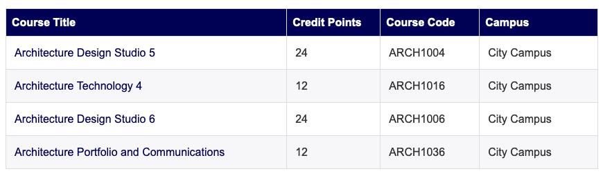
- Worked with design team to update visual style to provide clear table heading styles and alternating row styles
- Worked with the development team to ensure tables include the right ARIA attributes so that screen readers interpret them correctly
- Tables are built with <div> tags, hence the need to use ARIA. A more accessible solution would use <table>, <th>, <td>, <tr> elements, but using ARIA was a compromise we reached with stakeholders
Focus indicators
Several components have received updated keyboard focus styles to indicate they are active.
Primary button


Reverse button


Links


 Dr. Ronny Andrade Parra
Leave a comment